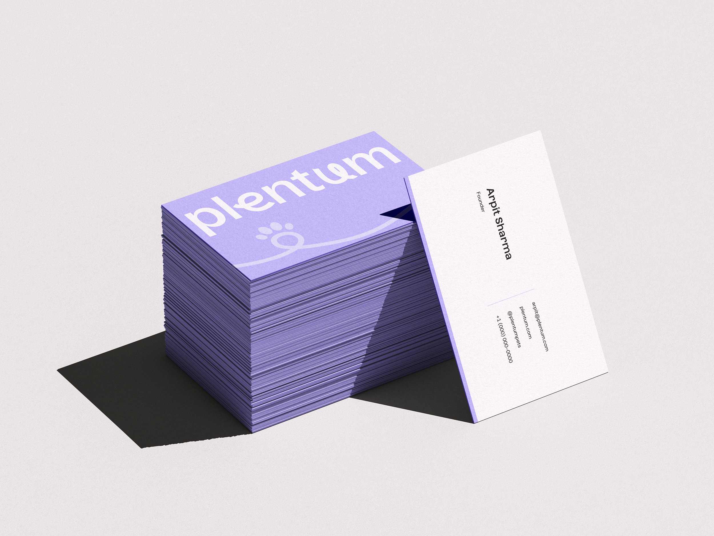
Plentum
VISUAL IDENTITY
ART DIRECTION
BRANDING & GUIDELINE
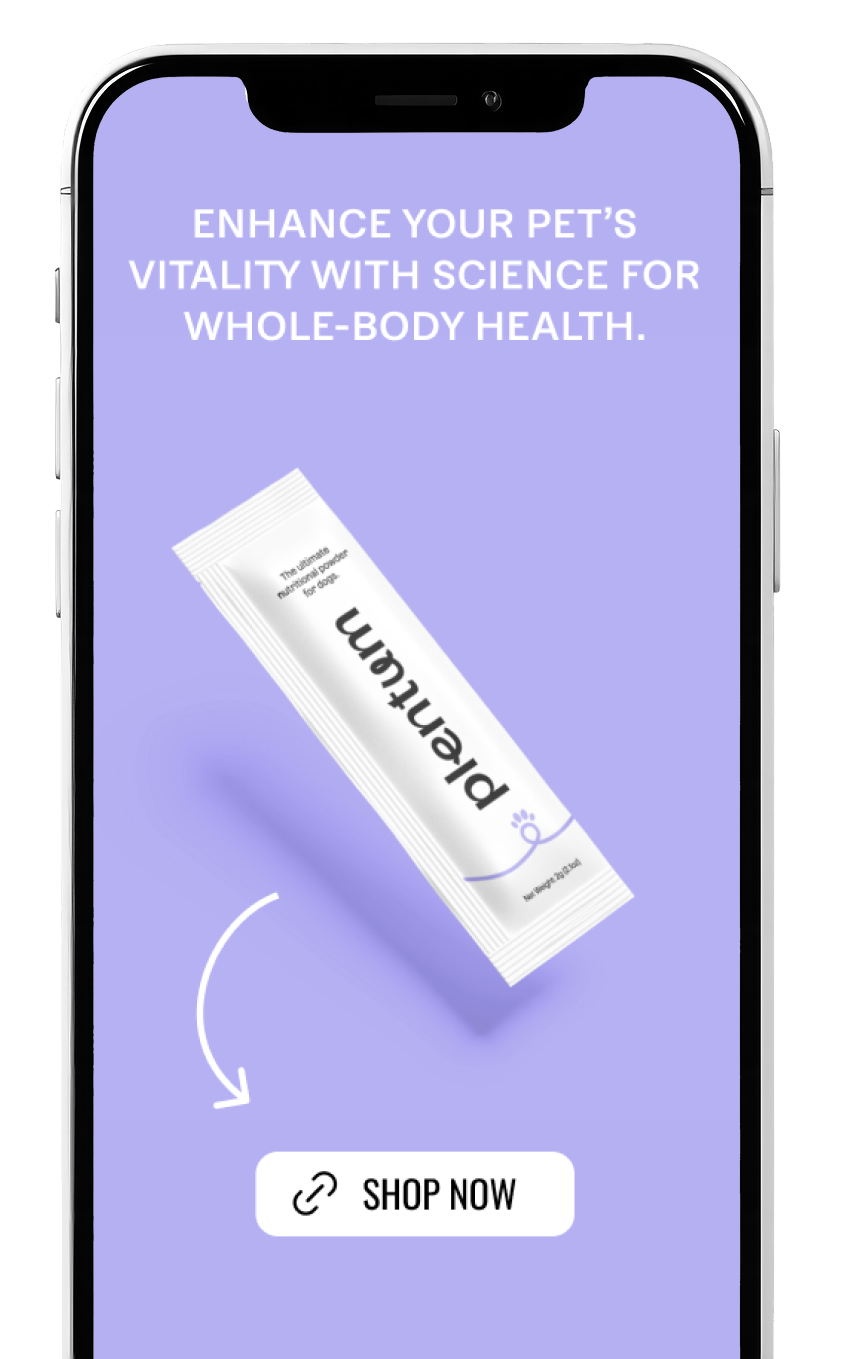
SOCIAL MEDIA CONTENT
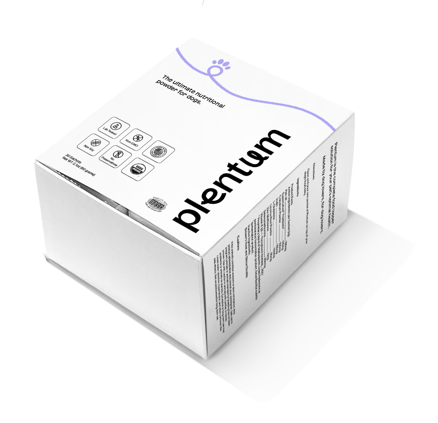
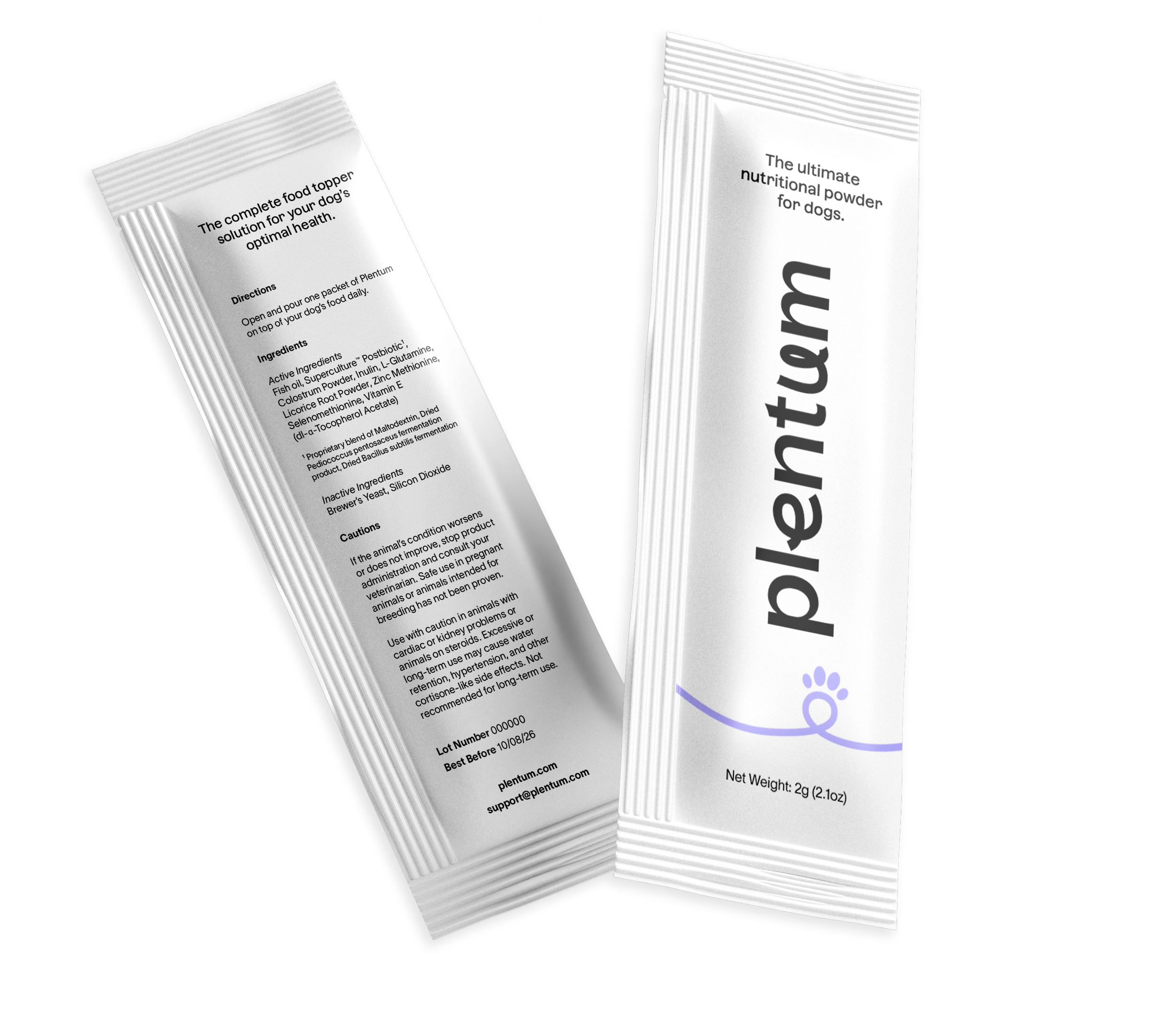
PACKAGING
Plentum is a powder supplement for dogs with science backed nutrition.
The goal was to create a friendly and minimal logo and brand identity combining approachable, playful and modern aspects of the brand. The design was made in a simple style with lots of white space to make it clean, easy to digest and add a bit of a science look.
Logo

The Plentum logo features the Azaret typeface in lowercase with customizations that create a modern, approachable feel.
The loops and whimsical curves of the letters evoke a sense of friendliness and playfulness, adding a touch of softness and forward-moving momentum to the design.
Brand Elements & Iconography


The symbols, from the star of excellence to the nourishing bowl and compassionate heart, embody our dedication to premium formulations and pet well-being. Elements like the sachet ribbon and circular stamp evoke trust, reliability, and authority, while playful touches like the paw motif add a dynamic, friendly energy to the identity.

Colors

The color palette reflects a balance of nourishing vitality and modern simplicity. The light and bright lavenders, combined with the fresh green, evoke a sense of wellness and growth.

Social Media


Packaging
Photography Selection